Trading Portfolio Redesign
Revamping the Trading Portfolio Space for better efficiency and faster decisions

Timeline
Jan - Mar 2025
Key areas
UX Strategy, Interaction Design, IA, Visual Design, Usability Testing
People involved
1 Product Designer, 1 PM, 5 Engineers
Redesigned the trading portfolio experience by improving navigation, surfacing key data, and simplifying bulk actions.
My role as a Product designer was to research and uncover areas where user's trading speed became slow and provide solutions by design and testing to improve efficiency
1.2x faster
Bulk-exit actions
1.5% more
Trades per day
What is Opinion Trading?
Probo is an opinion trading platform where users don’t bet, they invest in outcomes. Advanced traders manage dozens of positions daily across events like

Most traders don’t wait for the final outcome, they exit when the price feels right, just like in the stock market.
Trading process simplified

Click to enlarge
The Portfolio is their core tool—it lets them monitor performance, act fast, and improvise their strategy in real time.
Background
Who Are the Users?
We focused on Probo’s most active and invested users: Power and Ultra-Power Traders
Spend 3–9 hours a day on the app
Portfolios worth ₹10 Lakhs to ₹10 Crores


Despite being experienced, pro traders often struggled with:
😕
Hidden or scattered trade data
😕
Misplaced action buttons
😕
Inefficient navigation back to trade or topic
This leads to ↓
Lost Profit Opportunity
We wanted to change that — to make the Portfolio not just a tracker, but a fast-action terminal.
Transform passive trade tracking into fast, confident decisions.
Increase bulk action success rate
Reduce navigation loops
Improve decision speed
Encourage more trades from Portfolio view
Process at glance
01
Quant + Qual Research
Session recordings, funnel drop-offs, heatmaps, and a survey with 50+ Power Traders.
Design & Prototyping
Iterated quickly in Figma based on user inputs and tested it with real users
Validation
A/B tested with 20% of power users before full rollout.
1. Improving Bulk Actions
Research Insight : A survey among pro traders revealed key reasons for not using bulk actions
52%: Couldn’t find the right price
24%: Couldn't find right data on Portfolio page
21%: Bulk actions didn’t work as expected
3%: Other reasons
Since price control wasn’t in our hands, we focused on improving UX, particularly the second and third issues, supported by platform data.
Problem 1: Deciding When to Exit
Each event could contain orders in different states with 3 different Bulk Action CTA

But only one footer is visible at a time
Case with Bulk exit (Middle One)
Function
Exit all matched quantities
Information required to decide
Investment and Returns
Shown When
There are no unmatched/exiting quantities
Pains
Cannot use it when there are unmatched/exiting quantities
While prioritization helped streamline some workflows, bulk-exit actions were still used extensively, comprising 42% of all bulk actions.
However, 90% of the time, this action was deprioritized due to other order states.
High Requirement,
Low Visibility
→
Avg. Time take to exit:
3min
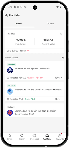
Additionally, key information like investment and return values was hidden, forcing users to navigate to the event detail page before making decisions. This back-and-forth caused critical delays.
Design Initiative
Redesigned event card showing investment and return data persistently on the event card
Before

After

Investment and Returns are now persistent
Other Cards Designs (Discarded)


Quick Swapping Bottom Sheet for all the Bulk actions in one place, without leaving the Portfolio through quick Bottom sheet
Before

After

Problem 2: Accidental Taps
Previous buttons were only 24dp in height, leading to frequent misclicks and navigation to unintended event pages
Solution
Increase Visual target (28dp -> 32dp) and Tappable areas (28dp -> 68dp)
Before

After

Improving Bulk Actions : Results
10% More
Bulk Exit usage (from 48% to 53%)
20% Faster
Avg. Exit time (from 3min to 2.5min)
2. Improving Navigation in the List
Scenario 1
Finding traded event right after placing trade
Expectation
Event should be at the top of list
Current Behavior
Browse through the list
Traded event at the top of list
Pains
None
Scenario 2
Finding traded event after a while
Expectation
Event should be at the top of list
Current Behavior
Browse through the list
Scanning to find hints of topic name - e.g. KKR v/s RCB - in event name or image
Pains
Not always possible - some events have name like "Virat Kohli to score 240 runs or more?"
Solution
Grouped events by topic*, clearly labeling each group with topic names and thumbnails
Automatically brought the topic of the most recently traded event to the top of the list
Content Hierarchy
⮑Cricket (Category)
⮑ IPL (Sub-Category)
⮑ PUN v KOL (Topic)*
⮑Who will win… (Event)

3. Increasing Overall Trades
Users frequently placed multiple trades under the same parent topic (e.g., Cricket with 9 events, Crypto with 60+). However, returning to a topic required a multi-step journey:
Portfolio → Event Detail → Parent Topicor
Portfolio → Home → Category → Parent Topic
Solution
Added direct hyperlinks to the topic name in the grouped list, enabling one-click access

Overall Trades : Results
+1.5% Trades/User
(from 3,043 → 3,499)
1 in 3 re-trades
now initiated from Portfolio itself
Prototype testing & improvement
High-fidelity Figma mockups were tested with actual pro traders. Key feedback:

Traders appreciated always-visible investment and returns info

Bulk actions were perceived as significantly more usable

In the initial prototype, the topic name was placed outside the grouped event box. This confused users, as they assumed the topic label belonged to other unrelated events. We resolved this by visually grouping the topic and its associated events within the same container, using proximity and alignment to reinforce the relationship. This improved recognition and reduced cognitive load during navigation.


Major Learnings
💡 Show data up-front: Always-visible returns & investments build trust and cut hesitation
🧱 Contextual grouping reduces friction: Topic clusters made trading feel continuous, not fragmented